
3 Tips for Vibrant House Portraits
House portraits capture the essence of a home like no other art form. Each home tells a story, reflecting the love and memories that reside within its walls. I take pride in creating accurate portraits that bring out the personality of each subject. Whether it’s a cottage, a house, or a barn, each becomes a meaningful keepsake that celebrates character and charm.

I’m going to demonstrate these three tips in my painting of the Coldwater Grist Mill in Ontario, Canada. I was commissioned to make a piece for a local silent auction this fall, and I selected this mill because I love how the vibrant red stands out against the surrounding trees and shrubs.
Tip 1
Noticing lights and darks adds depth to your painting and helps it pop out of the page. Knowing where to leave white space for highlights is crucial because, unlike acrylic paints, you can’t paint the white back in at the end. So before adding any paint, you need to find all of these highlights and ensure they remain white, either by avoiding them as you paint, or using masking fluid or tape to cover the paper.

Here, I am leaving the highlight on the railing in the foreground of the picture. I painting masking fluid (see my Essential Tools post) over the railings when filling in the river and greenery behind. Then I removed it and added shadows to the bottom of the railing. The contrast felt stark while I was painting it, but when I looked at the reference photo, the top of the railing was reflecting the sun and therefore bright white. In the end (see the photo at the top of the post) it all came together and added more interest to the painting.
Tip 2
Similar to leaving highlights, incorporating deep shadows adds depth and anchors your painting to the page. First, identify the light source (e.g. where is the sun shining from?) in your composition and use it as a guide to place your shadows. Sometimes I look at a photo without focusing on it (e.g., it will be a little blurry), which helps me see the contrasting colours rather than the details of the building. This contrast helps to highlight the unique features of the building, helping to capture its unique charm. I know it can be scary, but don’t shy away from using bold, dark hues; they will enhance the overall richness of your portrait and draw the eye to the intricate details that tell the story of the home.
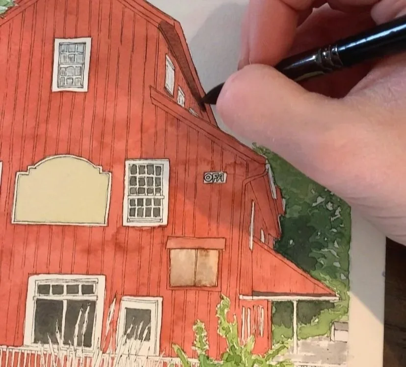
To make the shadow colour, I added purple to the remaining red paint. Blue could also be added, as cool colours help create deep shadows, but avoid black because it is a “dead” colour and reduces the vibrancy of the work (that said, I do occasionally use black, like when painting the windows). Always test your shadow colour on a scrap piece of paper to ensure you like the colour before adding it to your final work. I used my shadow mix under the eves, beside/under the windows, and on the right side of the building (again, see the final painting at the top of the post).
Tip 3
Limiting the number of layers in your watercolour painting can help preserve the vibrancy of your colours. If you go over the same area more than four or five times, you could risk creating a muddied and dull appearance. Layering is an important technique in watercolour, because it allows you to deepen the colour, but embracing some restraint allows ensures your work retains its brightness. I like to practice layering on a scrap piece of paper to test how the colours will look on top of one another after they dry.

To make the long grasses in the foreground, I left the space blank to ensure the white paper shown through to create highlights (as described in tip 1). I used a light brown colour in the first layer, leaving some white dappled through the grass. Then I painted over the first layer with green, painting some leaves and leaving others to create interest with two colours. Afterwards, I added another layer with deeper greens and browns in the middle and lower portions of the grass to create shadows (see the final painting above).
While there’s a lot more to painting a portrait, try incorporating these three tips first: leave some highlights, don’t shy away from dark shadows, and consciously layer colours to add depth without losing brightness. Gaining these skills helped me transform my building portraits from flat and dull to vibrant and interesting.